
01 / The Problem
Your first read on an international conflict shouldn't take 12 browser tabs
When an international event breaks, a single news report gives you fragments, not holistic understanding. The main location may be named at the top, but the rest of its international dynamics and its actors are never in visual form. You have to look up who is where, and how the geography plays a role, which we know it does. The historical backdrop is assumed to be knowledge the reader already has. And the article's own media slant is invisible unless you already know the outlet's political positioning.
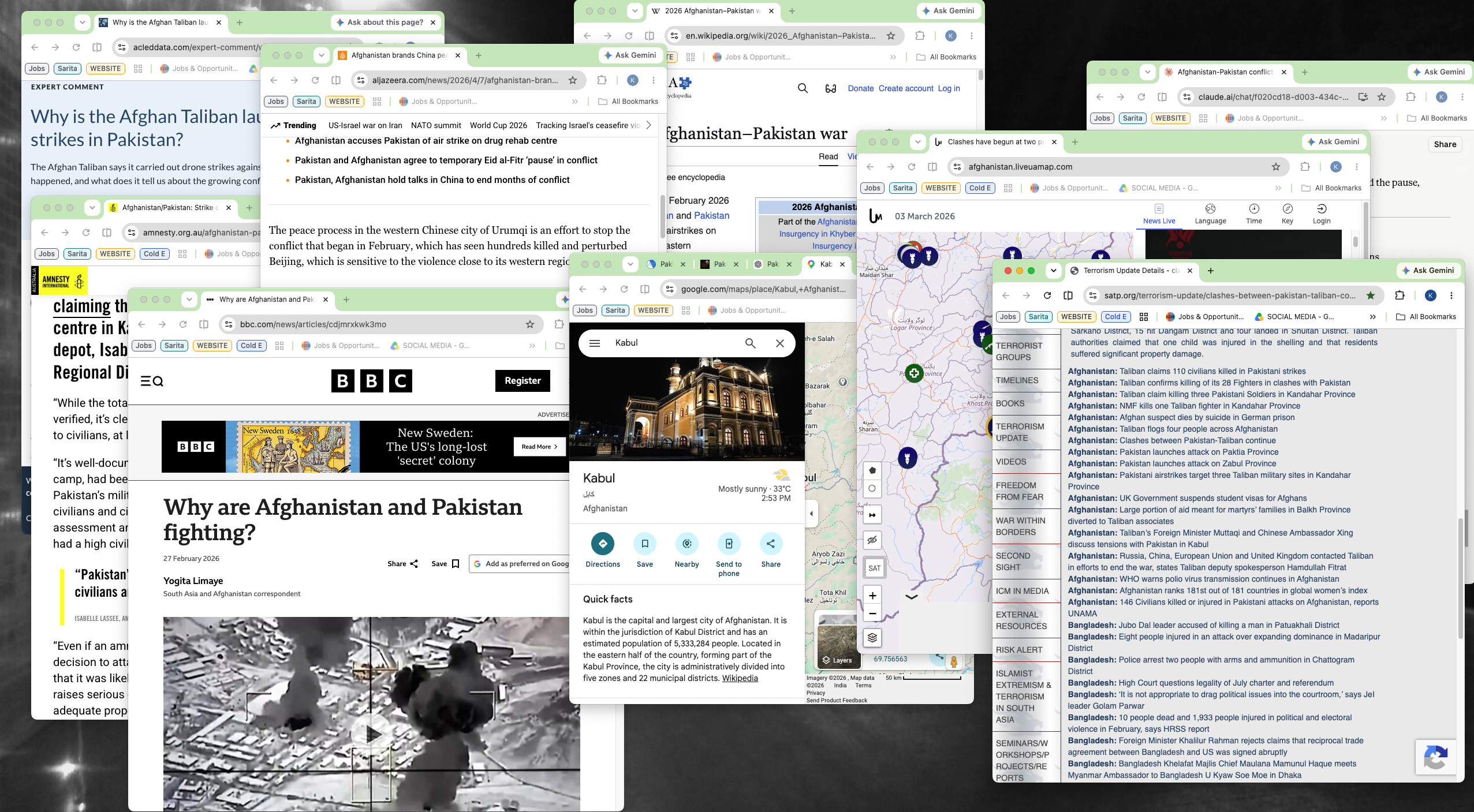
So an engaged reader does the synthesis by hand: open a second map tab to locate where the action occurred, skim Wikipedia to understand the history, and load a media-bias tool to detect the narrative framing. Three tools, ten minutes, and most readers give up before starting. Worse, the most rigorous reporting sits behind paywalls.
User Stories

Journalist
Jamila is a journalist, who wants a fast synthesis of an unfolding conflict's timeline, actors, and geography, so that she has a grounded starting point before she starts writing about a connected story.

Researcher & Tutor
Zaif is a tutor teaching an international affairs class, who wants an interactive, visual walkthrough of a conflict's history and media framing, so that they can quickly brief their students live on screen instead of narrating from static notes.

Reader
Amara is a member of a diaspora community, who wants to understand a conflict in her home region beyond the biased coverage that reaches her, whose framing she already distrusts, so that she can form her own read on events.
How might we take someone from a single article to a geographically-grounded, bias-aware understanding of an event in under a minute?
02 / Research & Insight
Research Findings
Who it's for
The core user is an engaged reader: students, analysts, policy makers, and globally-curious individuals. Their bottleneck is a lack of synthesis. The data is available, but the cognitive labor of assembling it is exhausting.
The market gap
An audit of the landscape revealed that existing tools are fragmented, offering one slice of context at a time:
| Dimension | AI Summarizers | Conflict Maps | Traditional News | Conflict Lens |
|---|---|---|---|---|
| Synthesis | ✓ | — | ✓ | ✓ |
| Geography | — | ✓ | — | ✓ |
| Bias Awareness | — | — | — | ✓ |
| Accessible | ✓ | ✓ | — | ✓ |
Value Proposition
Conflict Lens is the only tool that puts geography, history, and media bias in one view, turning a single article into a grounded briefing in under a minute.
03 / Defining the Product
The flow
For the MVP, I kept the scope extremely narrow. No user accounts, no saved dashboards, and no feed pages. The entire product is optimized for a single 3-step sequence: Input link or PDF → Run processing → Explore interactive briefing.
Cut on purpose: Accounts and multi-article comparisons were discarded to keep performance lightning-fast and focus on the immediate readability of paywalled articles.
04 / Desktop
The desktop interface
Three screens, one continuous flow. Each is shown as a wireframe, and the recording below is the built product.
Screen 1: Input
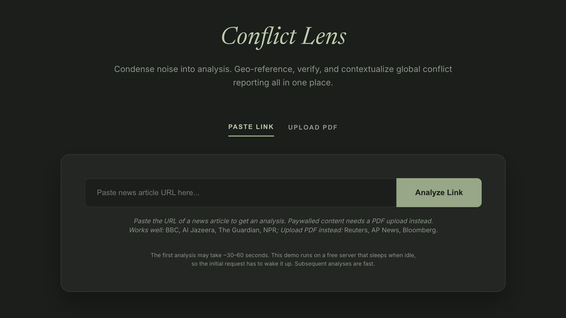
A quiet, editorial entry point of warm neutrals, sage highlights, and a clean serif title layout. A simple two tab selector allows pasting an article URL or dragging in a raw PDF file.
Screen 2: Analysis
The wait screen uses precise copy indicating what stage is processing: "Extracting primary incidents and locating actors (~5-10s)..." Honest state indicators manage expectations and lower perceived wait times.
Screen 3: The Briefing Dashboard
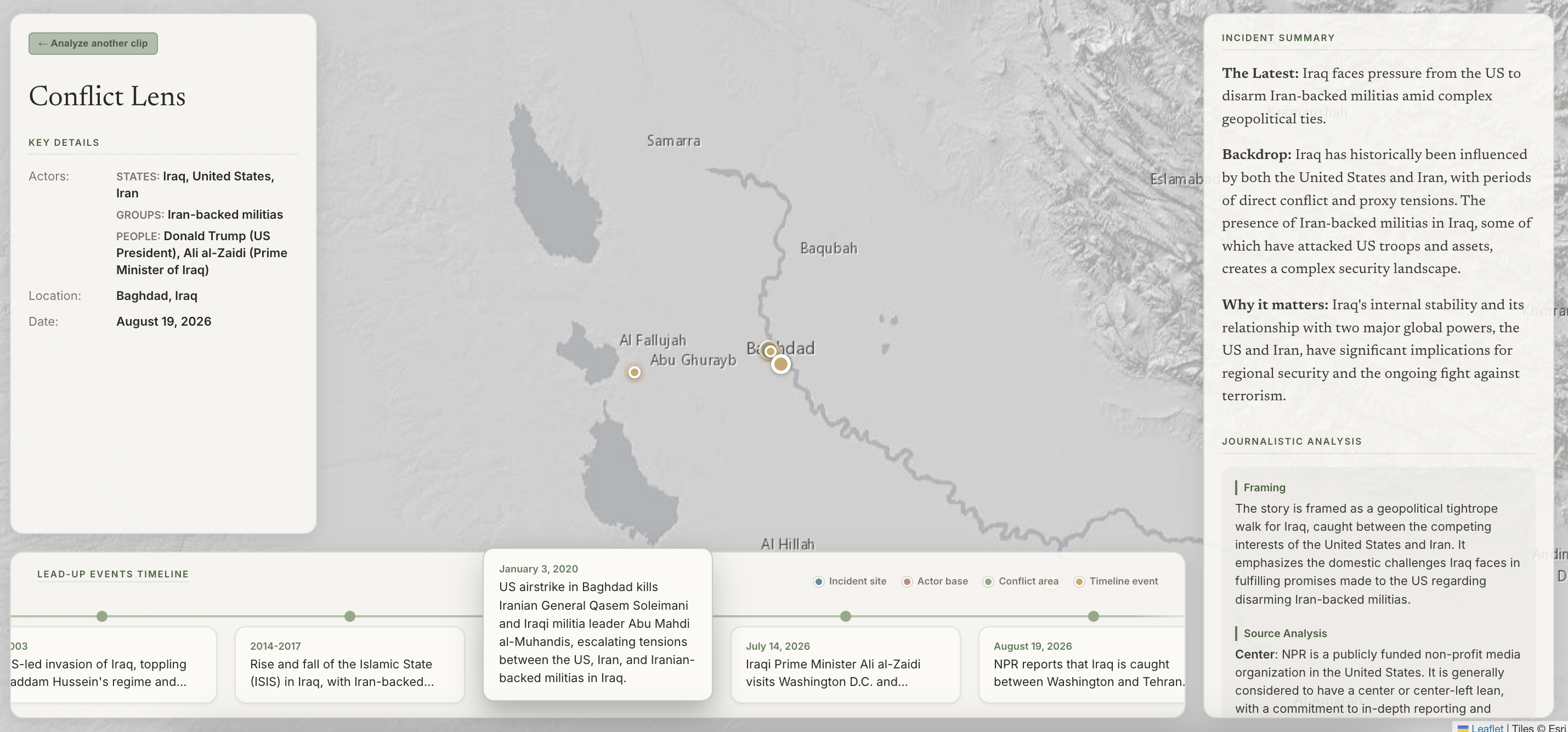
A dark, high contrast satellite map fills the background, with clean panels floating on top. Map boundaries automatically adjust on load to display all georeferenced events, with timeline markers matching the color coded map pins.
05 / Mobile
The mobile interface
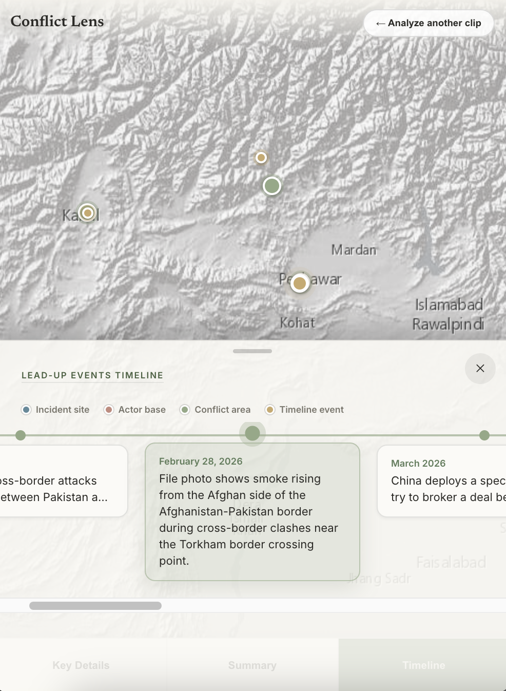
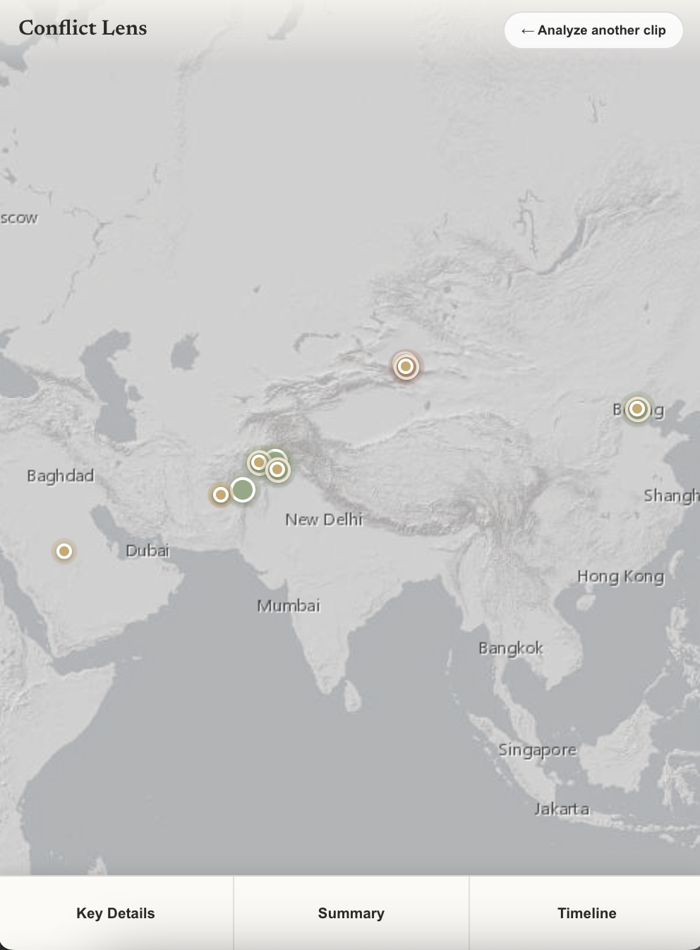
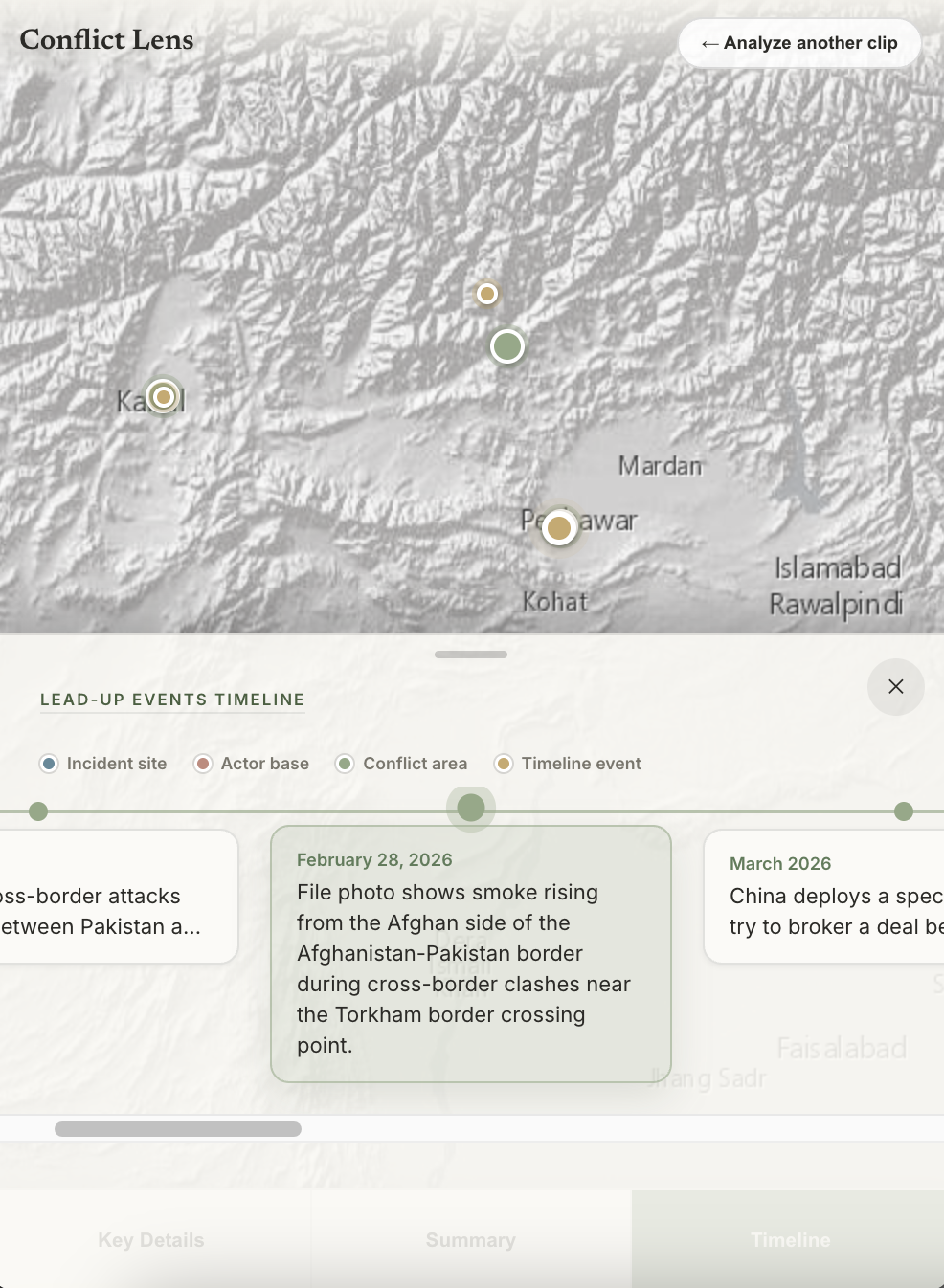
Floating overlays on desktop maps are great, but they cover the entire viewport on a mobile screen. Instead of wrapping overlays in tiny scroll zones, I reordered the layout so that the map remains the base layer, and a bottom sheet slides up dynamically.
06 / Key Design Decisions
Decisions and tradeoffs
Four principles came out of the research.
Geography leads, the text supports
Tension: The familiar layout puts the article first and the map off to the side, which leaves the reader doing the spatial work in their head.
Decision: Made the map the primary canvas and anchored every extracted event and actor to coordinates, so the narrative hangs off geography.
↳ Core Principle: Geography is the spine
Progressive rendering over single payload
Tension: Single API payloads are cleaner to maintain, but force a 25-second blank screen.
Decision: Segment the LLM pipeline into four distinct threads, painting the UI sequentially.
↳ Core Principle: Never make them wait
A PDF bypass for scraper paywalls
Tension: Scrapers cannot read premium publications without encountering subscriber login screens.
Decision: Built a PDF upload parser so users can save paywalled pages and process raw text directly.
Limitation: Some wire services (Reuters, AP, Bloomberg) don't paywall so much as actively block scraping with a 401 or 403. That's bot detection, not a login screen, and no amount of header spoofing gets around it. The UI now says upfront which outlets work as a link versus which need a PDF, and a blocked request shows a plain message instead of a raw error code.
↳ Core Principle: Meet the reader where the content is
Bias read, labeled as the model's view
Tension: The bias read is itself an automated judgment, and the model can hallucinate or carry its own slant, so presenting it as objective truth would be dishonest.
Decision: Kept the dedicated "Journalistic Analysis" panel, but state plainly in the product that Gemini produced the framing, so readers weigh it as one model's read and not a verdict.
Limitation: A single model grading bias is the current ceiling. A trained or second opinion agent to sort through the framing is the next step (see Reflection).
↳ Core Principle: Make bias visible
07 / AI + Safety Nets
Designing for AI
Language models are probabilistic systems. They can return malformed JSON, hallucinate URLs, or geocode coordinates to the middle of the Atlantic Ocean. Designing for AI requires building defensive UI safety nets around messy data.
Early prompts told the model to never leave a coordinate or a score empty, so under uncertainty it started inventing plausible-looking numbers instead. The fix was to let it say it didn't know. A model that always looks confident is more dangerous than one that visibly isn't, especially in a tool reporting on real conflicts and casualties.
Hallucinated Verification Link
"source_url": "https://www.bbc.co.uk/news/world-middle-east-99999999" (404 Not Found)
Geocoding Coordinates
"lat": 0.0, "lon": 0.0 (Lands in the ocean)
0,0 pins).
Hardening the AI pipeline
Putting an LLM in the request path also opens failure modes a typical app doesn't have to think about: the model can refuse to answer, get tricked, or become the thing an attacker targets. A few of those had to be treated as real states, not edge cases.
Failing safely on safety refusals
Tension: Gemini blocks responses it judges unsafe, but a naive integration assumes a response always contains a usable result.
Decision: Added explicit handling for blocked or empty responses, so a refusal shows a clear message instead of crashing on an unhandled error.
↳ Core Principle: Fail on purpose, not by accident
Closing a live vulnerability
Tension: An early parameter for overriding the system prompt had been built into the API but never connected to the frontend. It was live, unauthenticated, and invisible unless someone read the public source.
Decision: Removed it instead of locking it down, since the frontend never needed it. Left in place, anyone who found it could have run their own instructions through the app's API key and quota.
↳ Core Principle: Don't ship what you don't use
Hardening against prompt injection
Tension: The app reads scraped pages and uploaded PDFs, which makes that content its own attack surface. A page could hide instructions hoping the model follows them as if they came from the app.
Decision: Rebuilt the request so the app's real instructions sit in a separate, higher-priority channel from the article text, which is clearly delimited as content to read, not commands to follow.
Limitation: This isn't a complete fix. No known technique fully eliminates prompt injection, but it closes the obvious gap of pasting everything into one string.
↳ Core Principle: Untrusted input is data, not instructions
08 / Concept → Build
What building taught me
09 / Technical Architecture
Under the hood
Conflict Lens is four parts working together.
- Frontend Framework React with Vite builds the interface, React-Leaflet draws the map over muted greyscale satellite tiles, and the styling is hand tuned in custom CSS.
- Backend Engine Node and Express run several requests to Google Gemini at once, so each article is broken into structured pieces without a long single wait.
- Scraper Pipeline Cheerio and Axios pull the text out of a web page, pdf-parse does the same for an uploaded PDF, and a short lived Redis cache remembers recent pages so the same one is never fetched twice.
- Deployment The interface is served as static files on GitHub Pages, and the backend runs on Render's free tier.
10 / Reflection
What I learned, and what's next
Conflict Lens taught me that designing with AI is really about designing for volatility. We cannot control what the API returns, so the interface has to act as a filter. Keeping the system feeling fast with skeleton loading, setting honest expectations with clear waiting copy, and offering a next step when something fails can turn a fragile AI script into a trustable product.
If I were to expand the scope, here's what I'd prioritize next:
- A domain allowlist to flag unreliable sources before they're ever scraped, no model judgment required.
- Turning the existing verification links into real corroboration, fetching a competing outlet's coverage instead of just pointing to it.
- A second, differently-trained model run in parallel as a divergence check. Useful for catching the model hallucinating, though two models agreeing on a bad source still wouldn't make it true.
- On the interface: a chronological playback tool that animates the timeline and flies the map to each event, plus keyboard shortcuts to browse events.
- An option to increase or decrease font size for better readability, plus features for increasing accessibility like a high-contrast mode, colorblind-safe pins so actors aren't identified by color alone, and proper labels for screen readers on the map and timeline.